Gwynn
Well-Known Member
- Relationship to Diabetes
- Type 2
Or not...
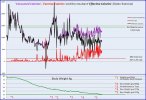
I have plotted calories eaten vs calories minus exercise, together with the exercise calories burned and the associated days body weight on a separate part. The graph covers the whole time since I started recording things sometime after diagnosis (hence the weight graph starts at around 80Kg).
It is an interesting graph showing the initial first few months of weight loss due to low calorie intake but very little exercise. Then a plateu where I was testing weight maintenance calories and other stuff. Then a final drive to my weight goal with raised calorie intake but significantly increased exercise.
Next will be weight maintenance.
I just think the graph is fascinating.
Doh! I got the title colours wrong.
Purple line is consumed calories
Red line is the daily exercise calories burned
Black line is the consumed calories minus the exercise calories or 'Effective Calories
Hopefully here is a corrected version

Sorry
I have plotted calories eaten vs calories minus exercise, together with the exercise calories burned and the associated days body weight on a separate part. The graph covers the whole time since I started recording things sometime after diagnosis (hence the weight graph starts at around 80Kg).
It is an interesting graph showing the initial first few months of weight loss due to low calorie intake but very little exercise. Then a plateu where I was testing weight maintenance calories and other stuff. Then a final drive to my weight goal with raised calorie intake but significantly increased exercise.
Next will be weight maintenance.
I just think the graph is fascinating.
Doh! I got the title colours wrong.
Purple line is consumed calories
Red line is the daily exercise calories burned
Black line is the consumed calories minus the exercise calories or 'Effective Calories
Hopefully here is a corrected version

Sorry
Last edited:
