PhoebeC
Well-Known Member
- Relationship to Diabetes
- Type 1
Hi folks,
Sharing as it took me a while to find this in Glooko, if you use the Omnipod 5. I couldn't work out which report would show when my pump hits "Insulin max reached".
My and my husband spent some time trying to find this, including on Glooko's FAQ/support pages but it is not clear at all. We even asked AI, with no luck, it sent us to the same website we had already found, and this doesn't have the answer.
In the O5 device this term is Insulin max reached and on Glooko this is Automated Max Delivery, same orange bar.
In the Omnipod 5 device on "sensor graph", this shows 24 hours of data and I wanted to see if there's a trend over a longer timeframe when I am over target level what the pump is doing, if I keep getting "Insulin max reached" I think I need to increase my corrective amount.
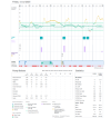
In the images the key shows Orange is the "Insulin max reached", at 5pm yesterday there is a small section, very tiny thin line of orange, so I know it didn't give me anymore insulin at that point, but it wanted to (I had a leaky pod). And at 8pm-ish we cannot see this as I did have manual bolus' which s the blue icon, which over any red or orange blocks.
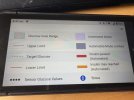
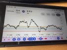
Online the key is similar but not same, mainly the terms used, "Insulin max reached" is "Automated Max Delivery" and also the other terms are different but with similar marker.
Important points:
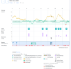
1 week
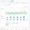
The 1 day display shows day at a time and you can use the arrows top left to change date, not ideal if you want trends of more than one day, this is the only way to see this level of detail on screen.
You can export further days into PDF by selecting "daily overview" and the time frame. I haven't selected longer than a week, but I did use custom for a few days and that worked. As below:
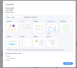
It shows each day on a page, again not ideal for easy compare but I sure there is a way this can be worked around. I might try AI again 😱
I never use the CSV export, I am sure some clever head here would know a better way to use that for the same need. Please share if you do.
I hope this helps someone else as we were very stumped here, and Glooko's FAQ was no use.
Now I will use the data to make a change
Sharing as it took me a while to find this in Glooko, if you use the Omnipod 5. I couldn't work out which report would show when my pump hits "Insulin max reached".
My and my husband spent some time trying to find this, including on Glooko's FAQ/support pages but it is not clear at all. We even asked AI, with no luck, it sent us to the same website we had already found, and this doesn't have the answer.
In the O5 device this term is Insulin max reached and on Glooko this is Automated Max Delivery, same orange bar.
In the Omnipod 5 device on "sensor graph", this shows 24 hours of data and I wanted to see if there's a trend over a longer timeframe when I am over target level what the pump is doing, if I keep getting "Insulin max reached" I think I need to increase my corrective amount.
In the images the key shows Orange is the "Insulin max reached", at 5pm yesterday there is a small section, very tiny thin line of orange, so I know it didn't give me anymore insulin at that point, but it wanted to (I had a leaky pod). And at 8pm-ish we cannot see this as I did have manual bolus' which s the blue icon, which over any red or orange blocks.


Online the key is similar but not same, mainly the terms used, "Insulin max reached" is "Automated Max Delivery" and also the other terms are different but with similar marker.
Important points:
- Both systems have different terms / sight visual differences
- This is under Graphs > Overview
- Time: 1 Day - another time period will not show this level of detail (the key changes, see images)

1 week

The 1 day display shows day at a time and you can use the arrows top left to change date, not ideal if you want trends of more than one day, this is the only way to see this level of detail on screen.
You can export further days into PDF by selecting "daily overview" and the time frame. I haven't selected longer than a week, but I did use custom for a few days and that worked. As below:

It shows each day on a page, again not ideal for easy compare but I sure there is a way this can be worked around. I might try AI again 😱

I never use the CSV export, I am sure some clever head here would know a better way to use that for the same need. Please share if you do.
I hope this helps someone else as we were very stumped here, and Glooko's FAQ was no use.
Now I will use the data to make a change
