• Please Remember: Members are only permitted to share their own experiences. Members are not qualified to give medical advice. Additionally, everyone manages their health differently. Please be respectful of other people's opinions about their own diabetes management.
  • We seem to be having technical difficulties with new user accounts. If you are trying to register please check your Spam or Junk folder for your confirmation email. If you still haven't received a confirmation email, please reach out to our support inbox: support.forum@diabetes.org.uk

Your thoughts on the forum upgrade (launch date 18th Feb)

Status
This thread is now closed. Please contact Anna DUK, Ieva DUK or everydayupsanddowns if you would like it re-opened.

Josh DUK

Former Online Community and Learning Manager
Staff member
Relationship to Diabetes
At risk of diabetes
Hello Everyone,

I thought I would share some details for the forum upgrade.

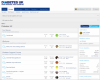
This is the new front page where we will list the topic sections. You can see some things have shifted around, but small changes here and there. It is much cleaner from the older version of the forum and the tabs and topics are located in the same area.

Capture4.PNG

If you click on someone's picture on the forum, it will pop up some information about the person and its similar to the live version of the forum.
Capture2.PNG
If you go to the persons page, you can still write on their profile and you can click 'start conversation' which was missing in the older version of the forum.

The reaction score shown on someone's profile is a calculated by the number of reactions people have with the post. It is essentially liking a post or giving it a heart.

It also displays profile posts, latest activity, postings, and about section if you would like to know more information about a member of the community.
Capture3.PNG
You are more than welcome to share your thoughts and we are planning to invite some users to test our some of the features of the forum.

Best,

Josh DUK
 

Attachments

  • Capture1.PNG
    Capture1.PNG
    148.3 KB · Views: 6
I thought that when likes were first introduced on this forum there was some concern about it turning into a popularity contest. Is this risk going to increase with the risk of hearts?
Has the new design incorporated the needs of those who have varying types of visual impairment?
 
Plus if someone starts a conversation will these be public as I know that one of the problems on the existing design is that people have started conversations (as opposed to pm’s) thinking they are private when they are actually available for everyone to see.
 
I am still having trouble inserting emoji things, ie when I click on them a list of forums comes up, like before.

Actually I don't see any difference on the front page as shown by Josh DUK, my screen shows the same as usual...? Or has the new front page not been installed yet?
 
When does a like become a heart? For the indecisive among us, this adds a new layer of worry - do I like it or do I "heart" it?

A great pity that you are not taking the opportunity to get rid of profile posts - many new posters must think they are being ignored when they ask questions via profile posts, and never make it to the forum proper.
 
I am still having trouble inserting emoji things, ie when I click on them a list of forums comes up, like before.

Actually I don't see any difference on the front page as shown by Josh DUK, my screen shows the same as usual...? Or has the new front page not been installed yet?

Josh’s post contains a picture of the new look and feel. They haven’t activated it yet.

hopefully they will be ironing out some of the bugs people have mentioned too (like the weird Smiley Menu glitch)
 
How do you get Watched Threads and New Posts. Currently seen like this:
20191127_212440.png
 
Please share any feedback what you want to change or you don't think it is needed. The profile posts is something we can look at in the back end and possibly disable. We can also possibly get rid of the reactions and just keep the likes.

The new upgrade is still being tested on our internal server, but we plan on inviting some users to test out the software.
 
Last edited:
Personally I think profile posts are not only unnecessary but are confusing to new(ish) members who may well think they are being ignored or that they are posting on the forum .
I detest the idea of reactions, jut keep the likes.

This is a peer support forum I would hate it to start looking like another social media site , imo it’s more important to cater for those with eyesight difficulties and easy to navigate around the site for newcomers than anything else.
 
Everything Lin said!
And please don't fix things which aren't broken - if forum users haven't asked you to change things, please don't change them for the sake of a fresh look, a lot of us will find that confusing and difficult to use.
 
Everything Lin said!
And please don't fix things which aren't broken - if forum users haven't asked you to change things, please don't change them for the sake of a fresh look, a lot of us will find that confusing and difficult to use.

From what I can tell the new style will adapt better to smaller screens / phones / tablets and should offer greater legibility if anything. Hopefully any users who are offered the chance of previewing the new look will be able to feedback any concerns over legibility or clarity. 🙂
 
From what I can tell the new style will adapt better to smaller screens / phones / tablets and should offer greater legibility if anything. Hopefully any users who are offered the chance of previewing the new look will be able to feedback any concerns over legibility or clarity. 🙂

That's great for people with smaller screens/phones/tablets, but please don't forget that some of us have old-fashioned computers with large monitors and we want it to work for us too! Please make sure some of the people previewing are using computers rather than phones etc, and also that not everyone previewing is using Windows (I'm using Chromium on a Linux machine).

To me the picture in Josh's post at the top looks confusing because:
* there are pictures where the current version doesn't have pictures, for no apparent reason
* the dark blue has gone, and everything looks very, very pale which makes it hard to distinguish anything
* profile posts - which no-one likes and which are confusing to newbies, and which several people asked to have removed - are still there
* I can't see the top menu of things like watched threads and new posts, as Ralph commented (though I realise that may be because the screenshot has cut those off the top)
 
Here is the top of the forum. Its quite difficult to get the entire forum image in. Also I am taking notes of all your feedback to pass it on to our digital team.


Capture 6.PNG
 
Last edited:
This is a peer support forum I would hate it to start looking like another social media site , imo it’s more important to cater for those with eyesight difficulties and easy to navigate around the site for newcomers than anything else.

These recent changes are something I have not been happy about for sometime now, This was started as a Peer Support Forum 11 years ago, and now as Ljc say's it is heading into a Social Media site, the fun has gone from this forum. I have to be careful what I say, I recently had a post deleted, WHY ? I was told that I cannot or must not dispute or discuss any actions taken by a Moderator, and this came from a Moderator that deleted the post, so right or wrong I have no right of reply. It is no longer the Diabetic Forum I enjoyed being a member of. It has moved away from the great work it promoted under the guidance of Northener. As for being the first member of this Forum, I am still fighting with myself as regards to leaving the group.
 
More smilies
1537632068.1918-smilie.gif
🙂
1537631915.3252-smilie.gif
:D
1536948360.551-smilie.gif
1536320230.9492-smilie.gif
1f607.png
1536916644.8352-smilie.gif
1536916928.0964-smilie.gif
1f6b6.png
 
Last edited:
Thanks, @Josh DUK

Jodee, I agree more smileys would be great, but those moving ones might make the forum unusable for people like me who have visual or neurological problems - I can't actually look at your post properly as the movement is overwhelming, and I'm having to type this with my eyes closed, and then cover half the screen with my arm when I look up to proofread. So the option to immobilise smileys for those of us who can't cope with the moving ones would also be good!

Oh dear that is a shame Juliet, I will take a few off, there are loads of still smiles too of course 🙂
 
Thanks, @Josh DUK

Jodee, I agree more smileys would be great, but those moving ones might make the forum unusable for people like me who have visual or neurological problems - I can't actually look at your post properly as the movement is overwhelming, and I'm having to type this with my eyes closed, and then cover half the screen with my arm when I look up to proofread. So the option to immobilise smileys for those of us who can't cope with the moving ones would also be good!
I didn’t realise that about the animated smilies , I sometimes use them on here, I will stop.
 
Status
This thread is now closed. Please contact Anna DUK, Ieva DUK or everydayupsanddowns if you would like it re-opened.
Back
Top