• Please Remember: Members are only permitted to share their own experiences. Members are not qualified to give medical advice. Additionally, everyone manages their health differently. Please be respectful of other people's opinions about their own diabetes management.
  • We seem to be having technical difficulties with new user accounts. If you are trying to register please check your Spam or Junk folder for your confirmation email. If you still haven't received a confirmation email, please reach out to our support inbox: support.forum@diabetes.org.uk

Freestyle Libre graphing

Status
This thread is now closed. Please contact Anna DUK, Ieva DUK or everydayupsanddowns if you would like it re-opened.

DeusXM

Well-Known Member
Relationship to Diabetes
Type 1
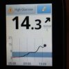
Does anyone else find the Freestyle Libre graphing scale a little odd?

View media item 97
I mean, the core range we're supposed to be in is, at worst, under 10, so the majority of the time, we should really expect to be in that 4-10 range, and inevitably there will be a few outliers but ideally, not too many. (for reference, in the above shot, I play a bit tighter so the blue bar represents 3.9-7.8)

But the graphing scale the Libre uses seems to be weighted VERY heavily towards very high blood sugars.Something like 2/3rds of the graphing space seems to be for hyperglycaemia which makes it very hard to see what's going on in the meaningful target range which makes it very hard to see at times how my blood sugar is changing. Is anyone else similarly frustrated by the graph almost expecting to you to run high while making it harder to see what's going on? I'm just really struggling to understand what was going through the designers' heads by building a graph that seems to expect people to hover around the 10-15 mark most of the time.
 
Fully agree with you here Deus. Its almost as if they think we must always be hyper. I wonder where that idea came from? Hmmm, maybe the fact that medics assume we need to be higher than we like to run at cos hypos are so bad (hence 'your HBA1C is too low. You must hypo all the time.' No, I am often at a very even keel of 5-6 (or whatever). 'No, you must be having unknown hypos.' Sigh...)
 
It shows the whole range that it's capable of reading, from HI to LO. My daughter unfortunately quite regularly spikes into the teens at the moment, yes I am working on it! So it's a bit more useful for us, when we do get good days though I agree it would be nice to see it closer up. They obviously forgot to program in a "zoom in" feature when the whole range isn't needed!
 
I know what you mean. It's the same with the LibreLink app, but it's a bit better as my phone has a much larger screen than the Libre reader.
 
Have to agree here, although clearly it needs to have the capacity to cover high readings. I just find the graph is so small for the blue shaded area that often you think that you have been all over the place and it looks like a photo of the alps, when in fact you might have been in range much of the time. Still loving it mainly though.
 
Agree, I' d like a zoom, and I find the screen that gives you 24 hrs worth makes it look like you've yoyoed up and down really steeply because it concertinas it all in. I prefer the 8 hrs worth screen you get just after you've tested, or the print out on the computer.
I proved this morning that I do need to see the upper echelons. Cross country on a frisky pony sent my adrenalin soaring, and my BGs. you can't really do a correction dose in the middle of a field, on a horse.image.jpeg
 
Does anyone else find the Freestyle Libre graphing scale a little odd?

View media item 97
I mean, the core range we're supposed to be in is, at worst, under 10, so the majority of the time, we should really expect to be in that 4-10 range, and inevitably there will be a few outliers but ideally, not too many. (for reference, in the above shot, I play a bit tighter so the blue bar represents 3.9-7.8)

But the graphing scale the Libre uses seems to be weighted VERY heavily towards very high blood sugars.Something like 2/3rds of the graphing space seems to be for hyperglycaemia which makes it very hard to see what's going on in the meaningful target range which makes it very hard to see at times how my blood sugar is changing. Is anyone else similarly frustrated by the graph almost expecting to you to run high while making it harder to see what's going on? I'm just really struggling to understand what was going through the designers' heads by building a graph that seems to expect people to hover around the 10-15 mark most of the time.

Personally, I think it needs to be a lot more flexible in terms of both ranges set, and display.

I know I'd an extreme oddity (well, that's what MrB says anyway. 🙂 ), but these days my routine running tracks are 3.5 - no higher than 6 at any stage in the day. As a consequence, on the reader graphs, I pretty much show the smoothest of undulations. I am also quite regularly under 3.5, which does show, but the scaling implies I'm almost expired at that point, as opposed to doing what many non-diabetics do when they're having a decent sleep, or very hungry. I wish I could choose which part of the scale it could focus upon.

Of course, the laptop software graphs and graphed out downloaded data show things more clearly.

All of that said, it's a fabulous tool and even when I thought I already had a great handle on things, I've learned a load from using the Libre from time to time.

On a general note, Deus, when we consider the findings of the National Diabetes Audit data, we're all a bit odd in our levels of decent control. I always find reading those audit reports rather sad.
 
Fully agree with you here Deus. Its almost as if they think we must always be hyper. I wonder where that idea came from? Hmmm, maybe the fact that medics assume we need to be higher than we like to run at cos hypos are so bad (hence 'your HBA1C is too low. You must hypo all the time.' No, I am often at a very even keel of 5-6 (or whatever). 'No, you must be having unknown hypos.' Sigh...)


Unfortunately it seems to me to suggest that Abbott feel that the vast majority of their users spend their time running higher averages than most of us find desirable.
Agree, I' d like a zoom, and I find the screen that gives you 24 hrs worth makes it look like you've yoyoed up and down really steeply because it concertinas it all in. I prefer the 8 hrs worth screen you get just after you've tested, or the print out on the computer.
I proved this morning that I do need to see the upper echelons. Cross country on a frisky pony sent my adrenalin soaring, and my BGs. you can't really do a correction dose in the middle of a field, on a horse.View attachment 1578


Neeeeyyyyyy lady. Whoops sorry 😛
 
Status
This thread is now closed. Please contact Anna DUK, Ieva DUK or everydayupsanddowns if you would like it re-opened.
Back
Top