- Relationship to Diabetes
- Type 1
- Pronouns
- He/Him
Just something for people to consider?
The forum software allows members to add a ‘signature’ below each of their posts. This can be helpful to other members because it sometimes details things about their diabetes management (eg if they are on a certain medication, or use a particular diabetes technology). it helps give a bit of backstory and context, and can mean members don’t have to keep re-asking questions, or offer inappropriate suggestions.
Some members also use their signature to chart their progress as an encouragement to others.
However when forum signatures get longer, they can begin to break the ‘flow’ of threads as posts become separated by larger pieces of essentially off-topic information. This is especially acute when people are viewing on smartphones or tablets, where signatures can take up a whole screen of ‘space’.
You may have noticed that some clever forum folks are using a function of the forum software to trim down the appearance of their signature and improve the forum experience for other users.
But how are they doing this clever trick?
It is by using the ‘spoiler’ feature (originally intended to avoid people inadvertently reading plot twists in discussion of films etc on other forums). The text is there, but it remains hidden until users click to reveal it. This means that you can have both a ‘compact’ and ‘full’ signature, retaining all the detail, while only initially showing the first few lines.
First, click your avatar in the forum menu bar and select ‘signature’

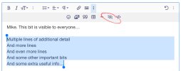
Then select the section of the text that you want to hide, and choose the ‘spoiler’ button in the toolbar which looks like an eyeball with a line through it

A grey panel will float over the editor, with a pop-up text box towards the top of the screen allowing you to add a title to your additional text

Then click ‘save’ to save your changes and your signature will have changed to have a clickable button underneath which forum members can use to show the additional details. The title you gave (above) is preceded by the words ‘Read more: ’

I think it would be much appreciated by members who browse the forum using smartphones if people who have longer signatures could use this approach to keep the section of their signature which is generally visible down to approx 3-5 lines of text.
🙂
The forum software allows members to add a ‘signature’ below each of their posts. This can be helpful to other members because it sometimes details things about their diabetes management (eg if they are on a certain medication, or use a particular diabetes technology). it helps give a bit of backstory and context, and can mean members don’t have to keep re-asking questions, or offer inappropriate suggestions.
Some members also use their signature to chart their progress as an encouragement to others.
However when forum signatures get longer, they can begin to break the ‘flow’ of threads as posts become separated by larger pieces of essentially off-topic information. This is especially acute when people are viewing on smartphones or tablets, where signatures can take up a whole screen of ‘space’.
You may have noticed that some clever forum folks are using a function of the forum software to trim down the appearance of their signature and improve the forum experience for other users.
But how are they doing this clever trick?
It is by using the ‘spoiler’ feature (originally intended to avoid people inadvertently reading plot twists in discussion of films etc on other forums). The text is there, but it remains hidden until users click to reveal it. This means that you can have both a ‘compact’ and ‘full’ signature, retaining all the detail, while only initially showing the first few lines.
First, click your avatar in the forum menu bar and select ‘signature’

Then select the section of the text that you want to hide, and choose the ‘spoiler’ button in the toolbar which looks like an eyeball with a line through it

A grey panel will float over the editor, with a pop-up text box towards the top of the screen allowing you to add a title to your additional text

Then click ‘save’ to save your changes and your signature will have changed to have a clickable button underneath which forum members can use to show the additional details. The title you gave (above) is preceded by the words ‘Read more: ’

I think it would be much appreciated by members who browse the forum using smartphones if people who have longer signatures could use this approach to keep the section of their signature which is generally visible down to approx 3-5 lines of text.
🙂
